My UI Design Inspiration: 6 Go-To Reference Sites
From Mobbin to Checklist Design, here are the 6 design reference sites I open most often when working on product design.
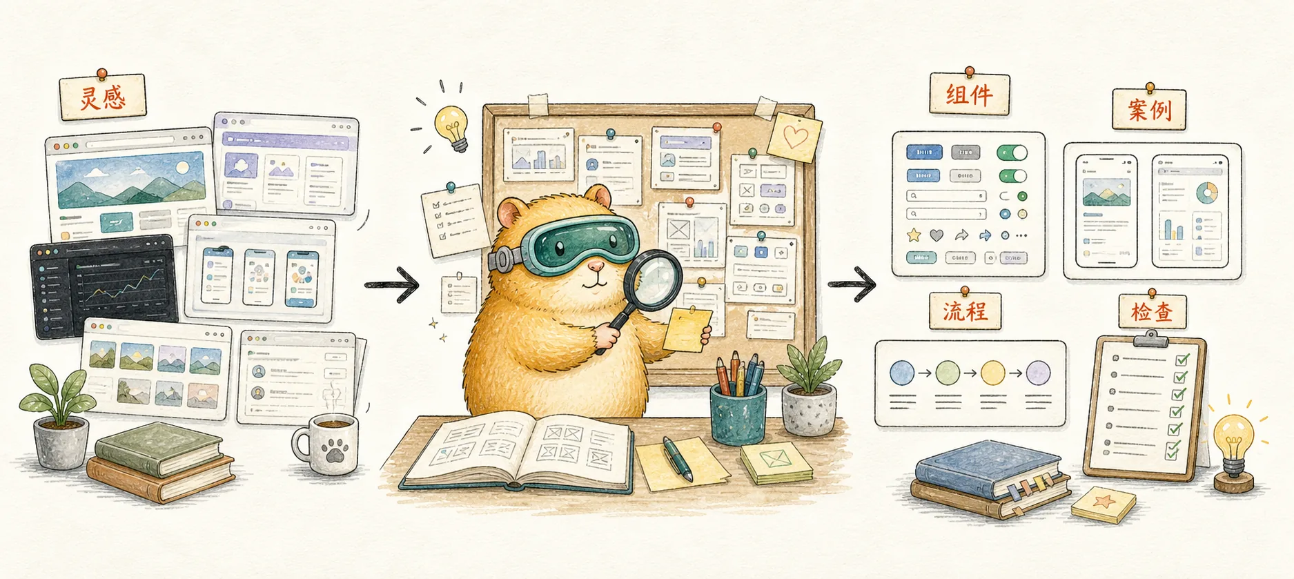
When you're building an indie product or designing interfaces, the hardest part isn't writing code — it's figuring out what the UI should actually look like.
You open Figma, stare at a blank canvas, and all you can think is, "How did other apps handle this again?" We've all been there.
Instead of designing from scratch, why not see how real products do it? Here are the 6 design reference sites I use most often. Together, they cover everything from mobile to web, screenshots to user flows, design checklists to AI-built apps.
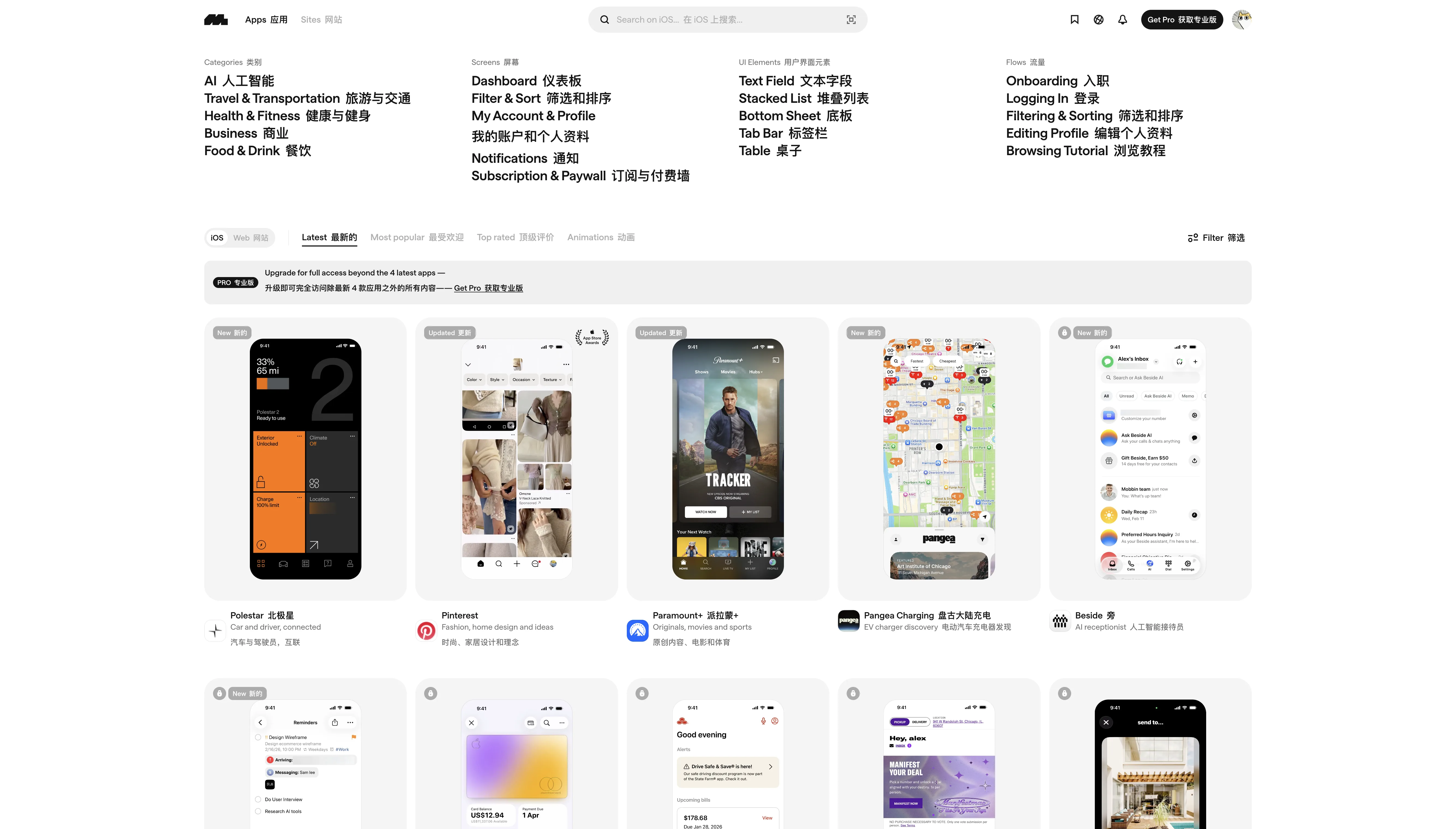
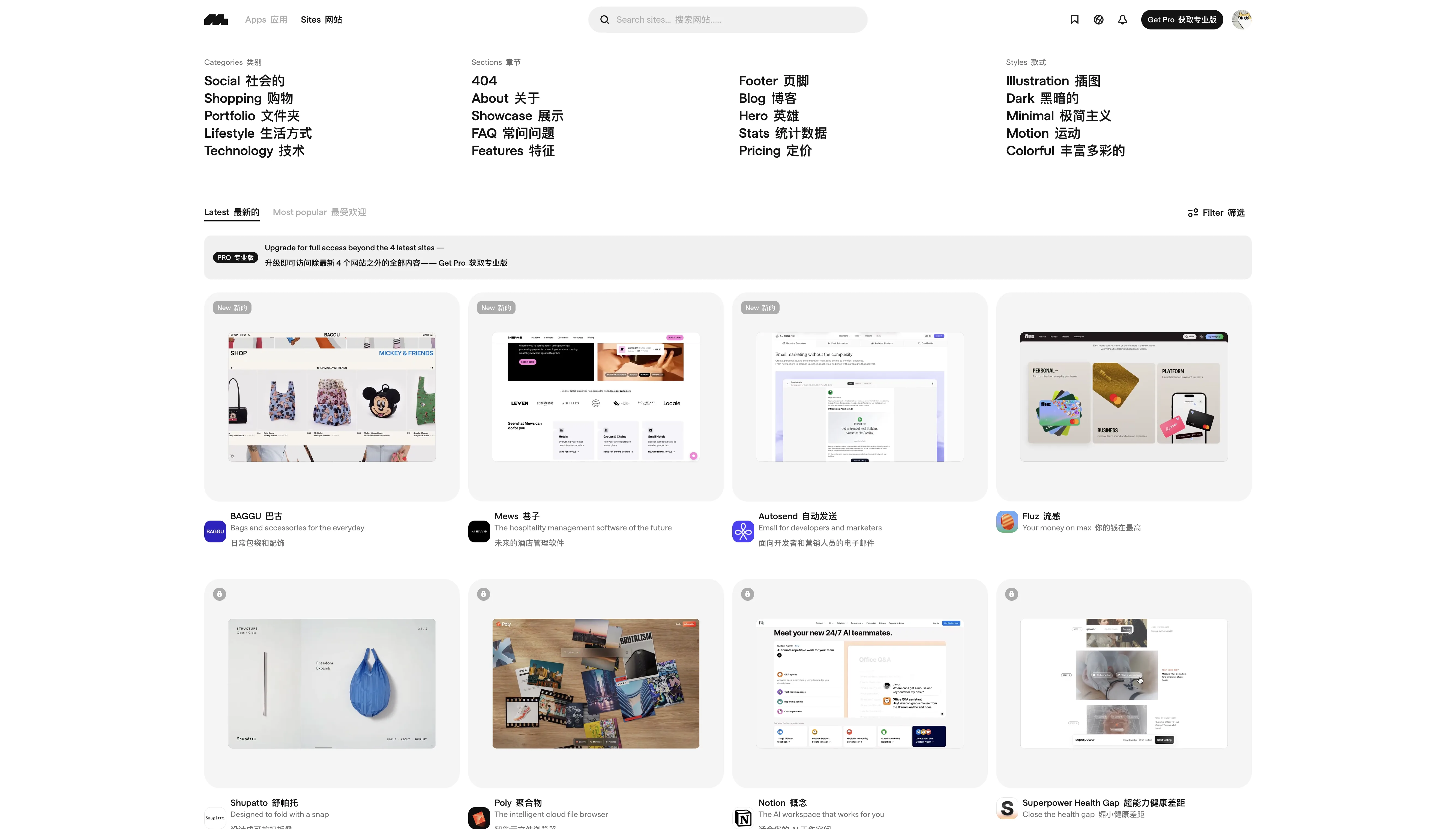
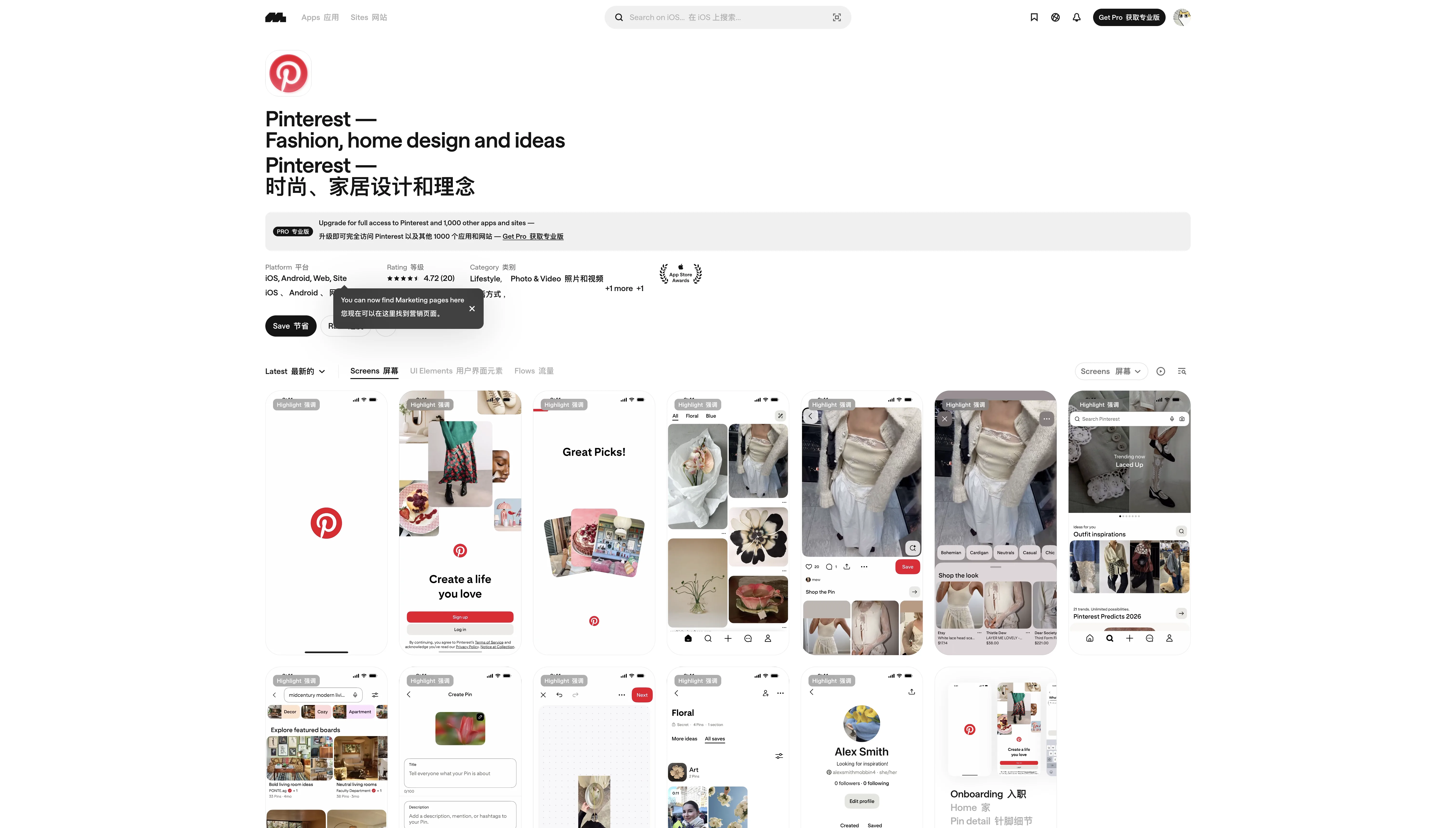
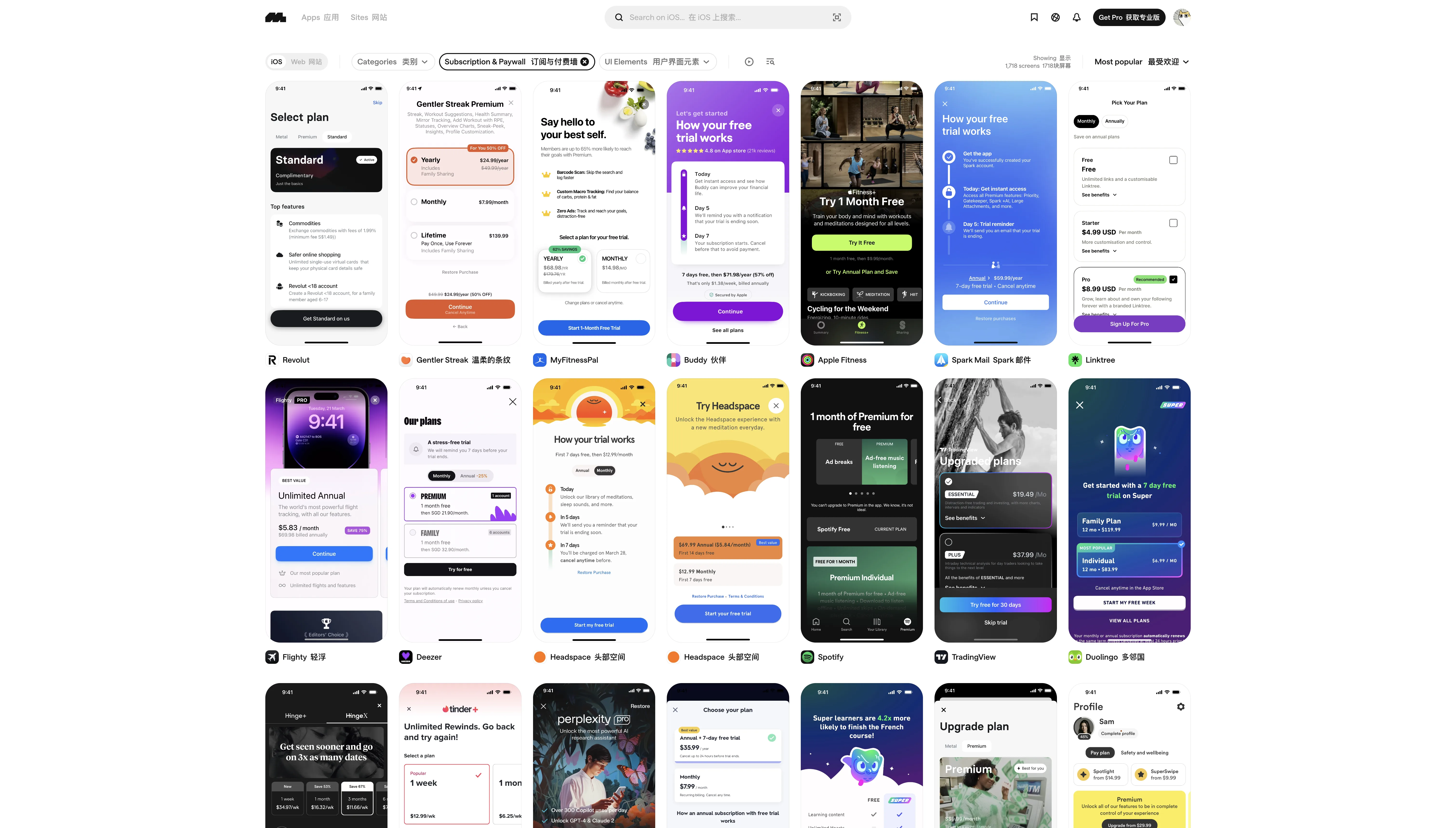
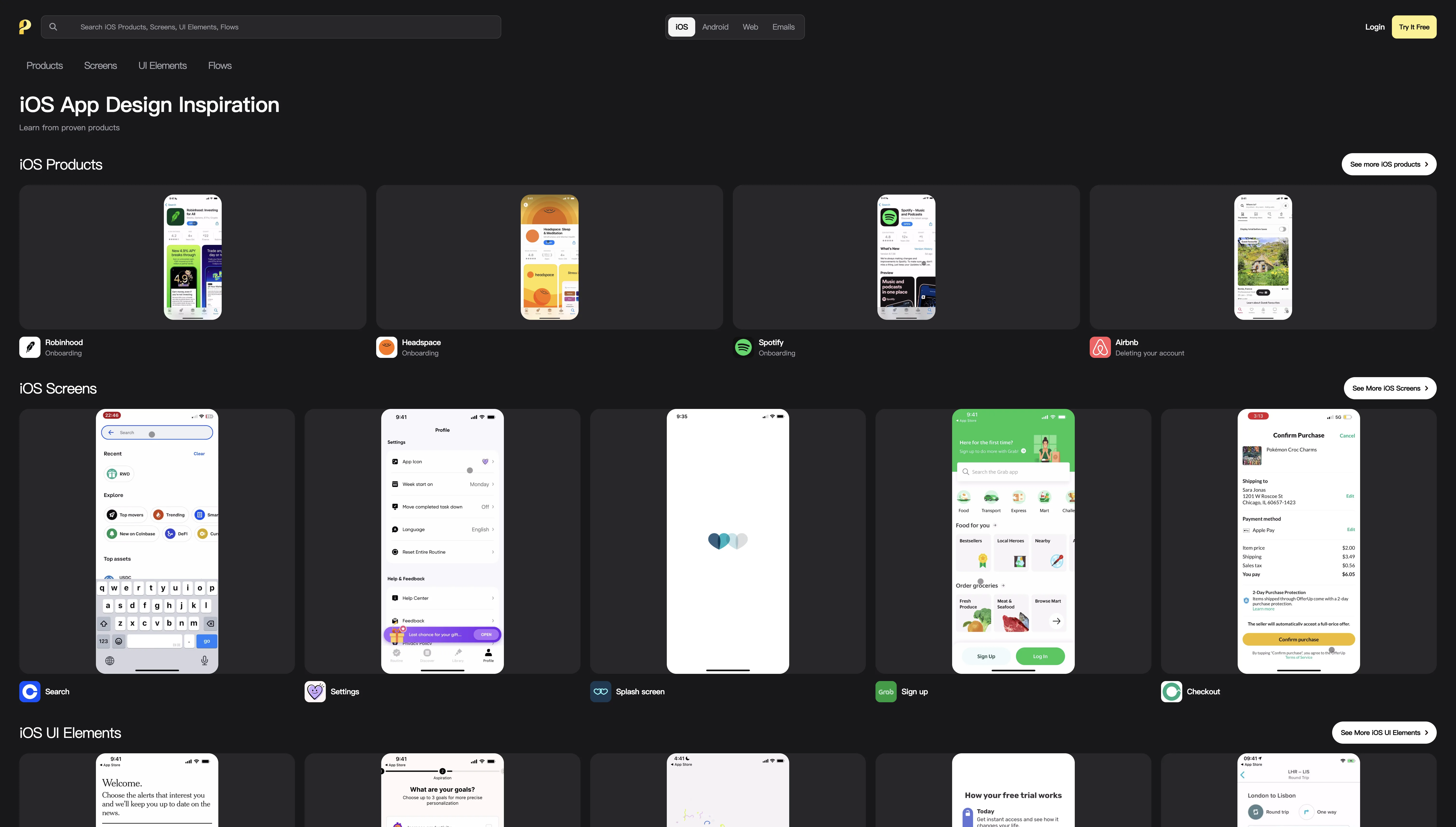
Mobbin is hands down the design reference site I use the most.
Its core value lies in breaking down real product UIs into a searchable design pattern library. You can browse across four dimensions: by app category (AI, health, food & drink, etc.), by screen pattern (dashboard, filter & sort, notifications, etc.), by UI element (text field, bottom sheet, tab bar, etc.), and by user flow (onboarding, login, checkout, etc.).
It covers both iOS and web. The web section also supports filtering by visual style — dark, minimal, colorful, motion, and more — which is incredibly useful for landing page inspiration.
Best for: When you're designing a feature and want to see how others handle it — e.g., "What do subscription pages typically look like?" or "How do top apps design their onboarding flow?"
Free vs. paid: Free users can browse the latest 4 apps/sites. Pro unlocks everything.
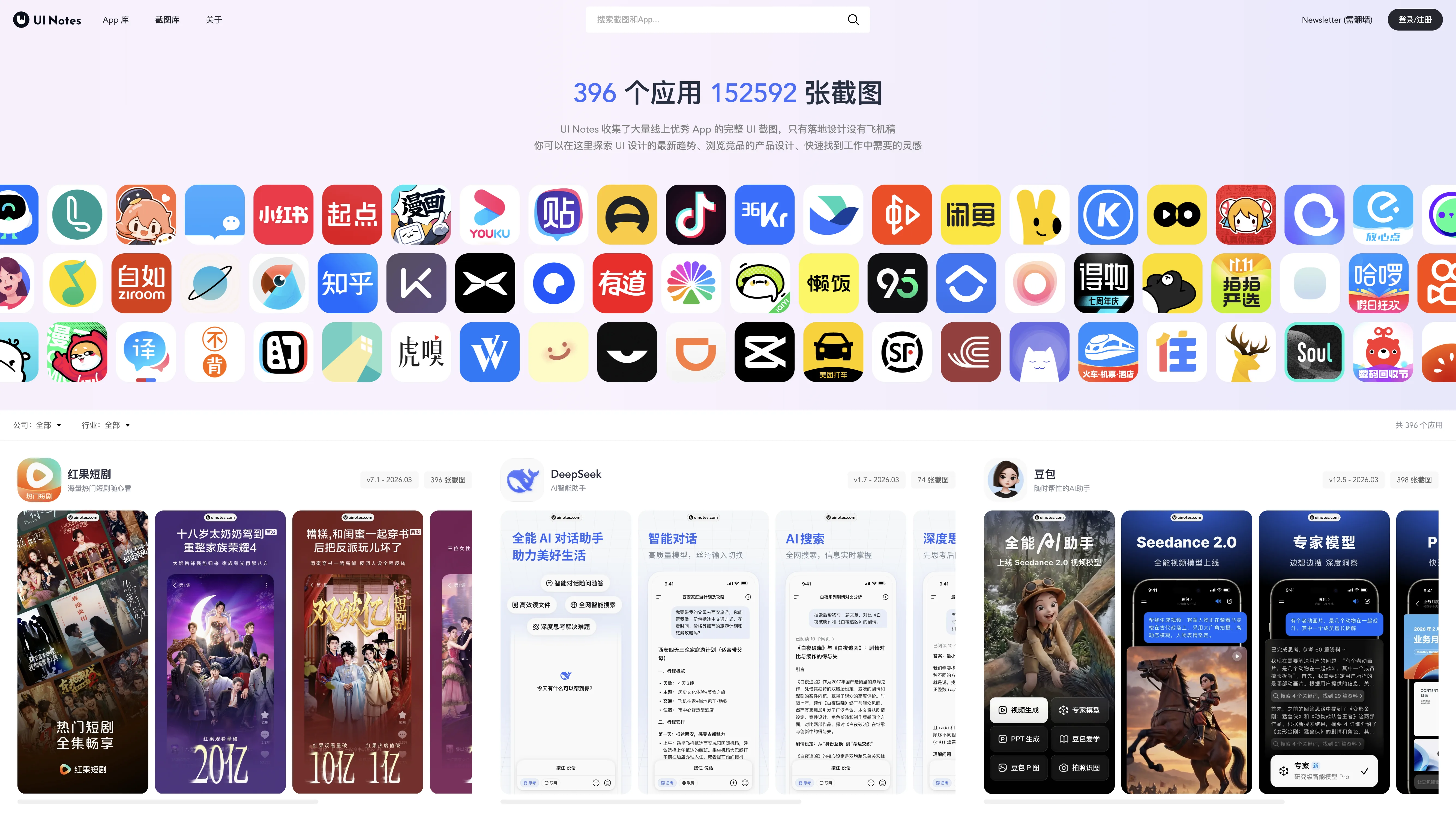
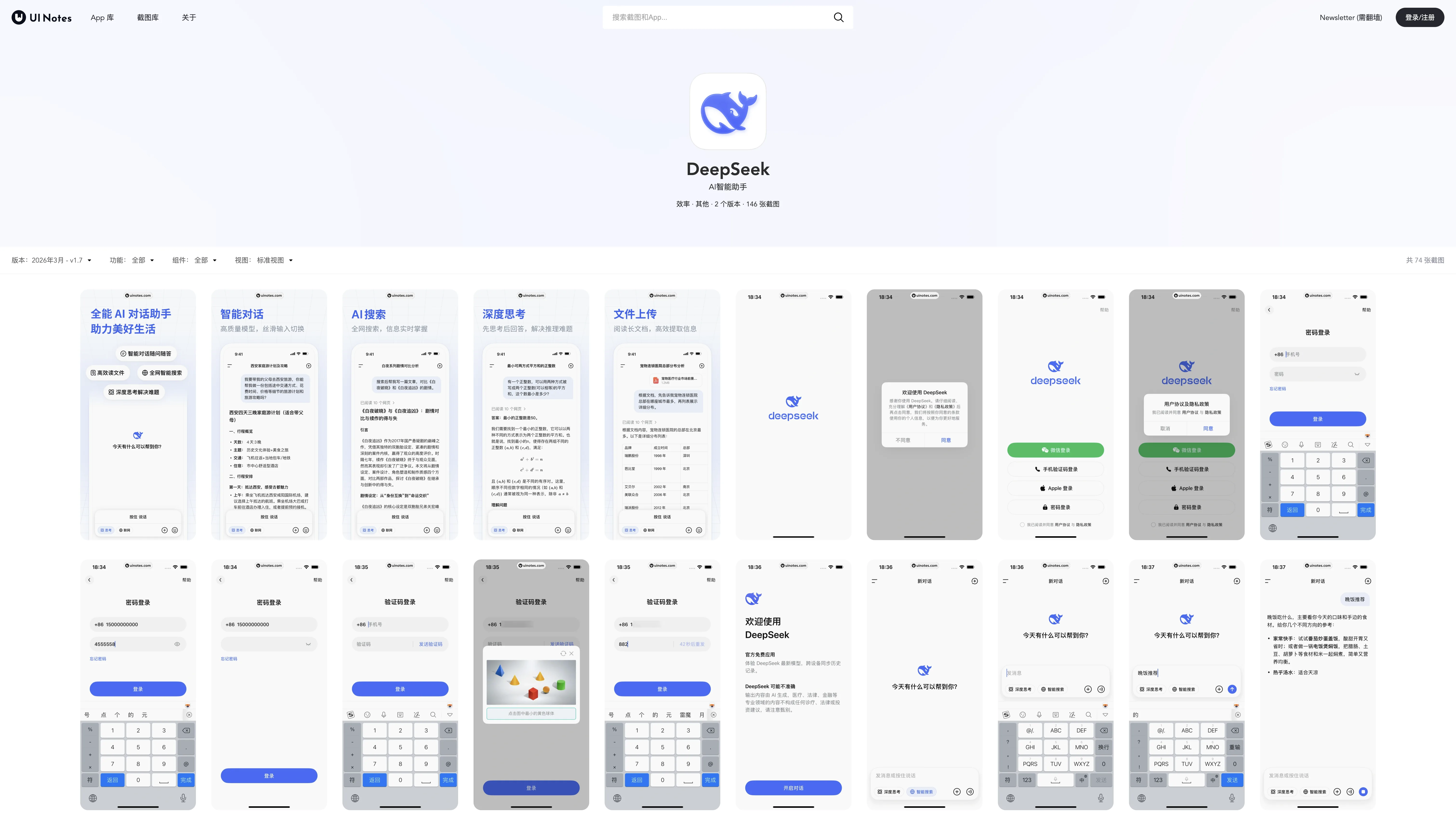
If Mobbin covers global products, UI Notes is the encyclopedia for Chinese product design.
396 apps and 152,592 screenshots — the sheer volume speaks for itself. It only features shipped designs, no concept work. Every screenshot you see is from a real, live product.
The apps cataloged are ones commonly used in China: Doubao, DeepSeek, Coze, Hongguo, Yuanbao, TapTap, and more. You can filter by company (ByteDance, Tencent, Alibaba, etc.) or by industry. Each app entry also includes version numbers and update timestamps, so you can trace how the product has evolved over time.
Best for: Building products for the Chinese market and wanting to see competitor interfaces and design trends.
Free vs. paid: Basic browsing is free; a membership unlocks additional features.
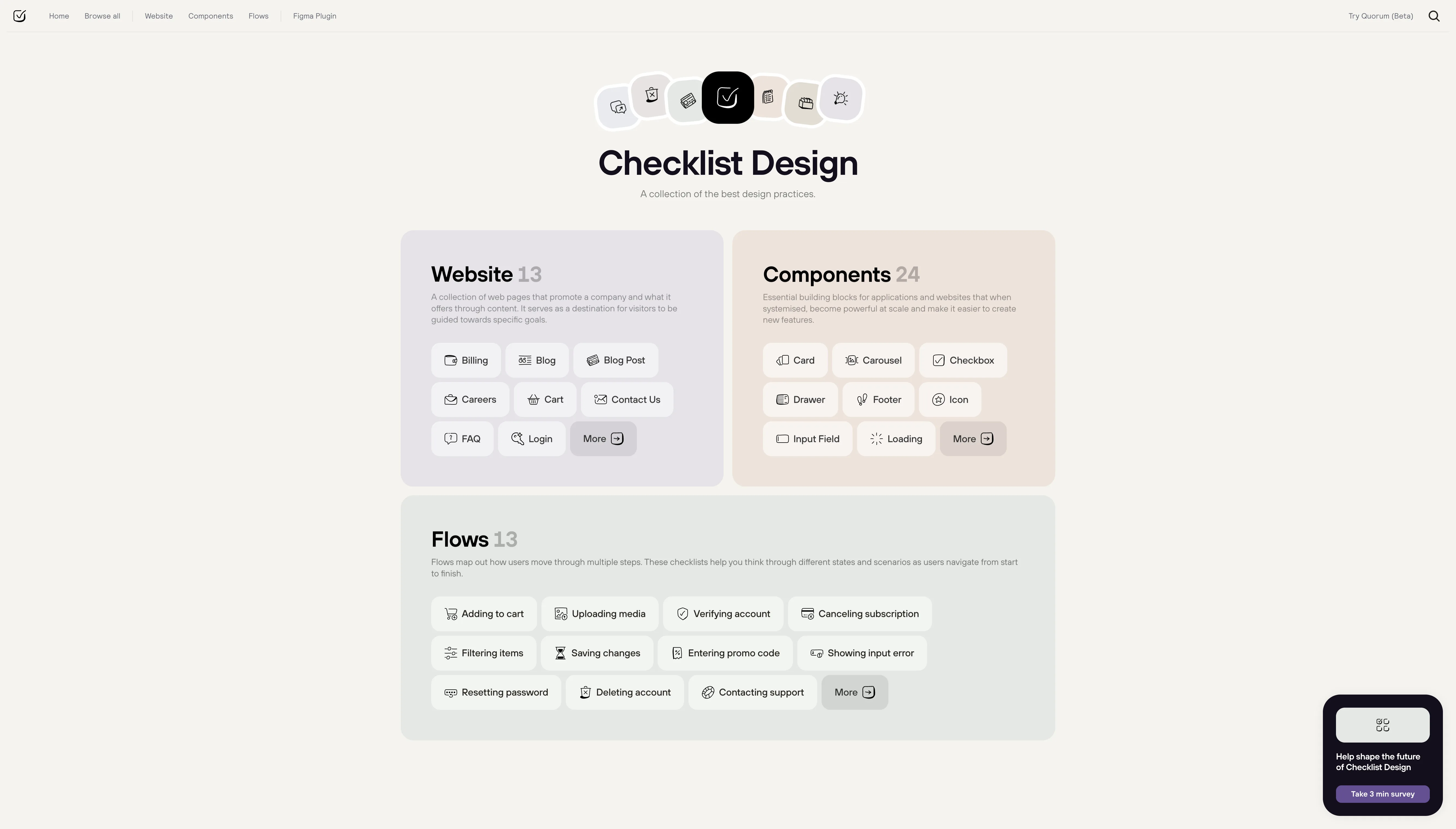
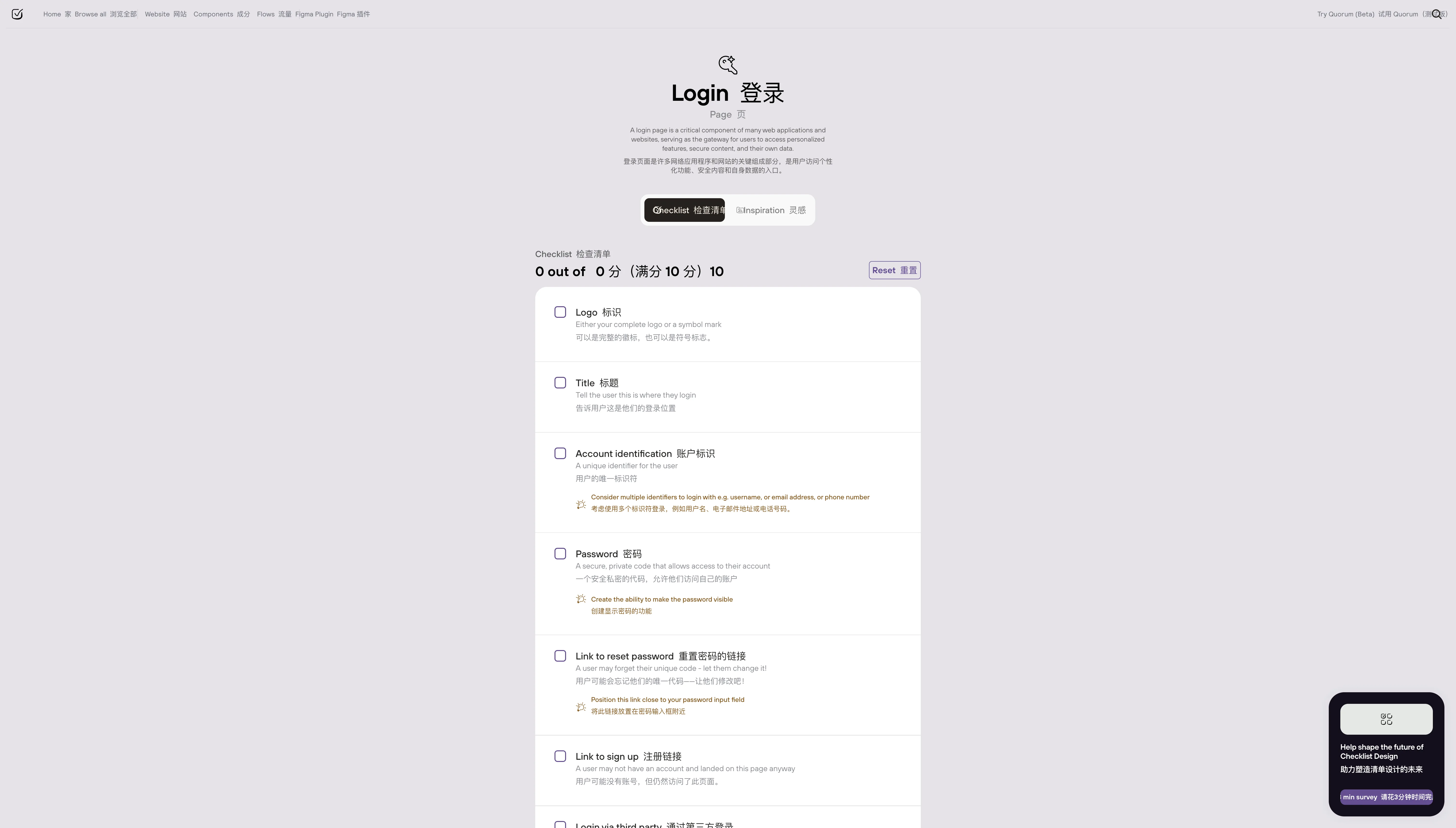
This site takes a completely different approach — instead of showing you other people's designs, it tells you what to watch out for when designing something.
56 checklists across five categories:
- Website (13): Login pages, billing, blog posts, shopping carts, FAQs, and more
- Components (24): Buttons, modals, input fields, toasts, carousels, and more
- Flows (13): Add to cart, cancel subscription, reset password, delete account, and more
- Topics (3): Responsive design, UX copy, dark mode
- Brand (3): Logo, typography, tone of voice
Each checklist is a set of best-practice items — things like "Login pages should have a show/hide password toggle" or "Modals should close on ESC." There's also a Figma plugin so you can run through checklists directly in your design tool.
Best for: Self-reviewing after a design is complete, or establishing standards when starting a new component. Especially valuable for beginners building design system awareness.
Free vs. paid: Completely free.
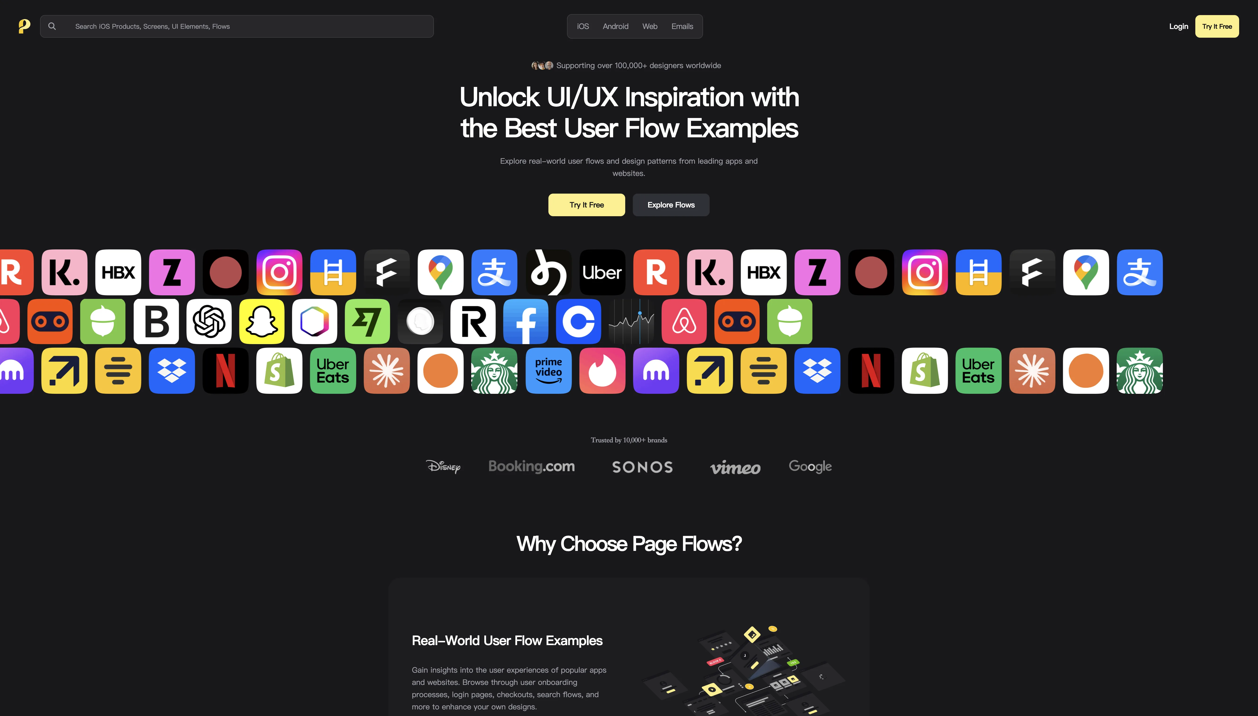
While other sites show you individual screenshots, Page Flows shows you complete user flows.
Its core feature is screen recordings — you can watch a real user go from opening an app to completing an action, with step-by-step annotations along the way. For example, "How does Airbnb guide users through its search flow?" or "What does Dropbox's onboarding look like?"
It covers four platforms — iOS, Android, web, and emails — and is used by over 100,000 designers. You can filter by category, industry, and UX pattern.
Best for: When you're designing a user flow (onboarding, sign-up, checkout, etc.) and want to see how top products handle it.
Free vs. paid: 3-day free trial, then $8.25/month (annual) or $13/month (quarterly).
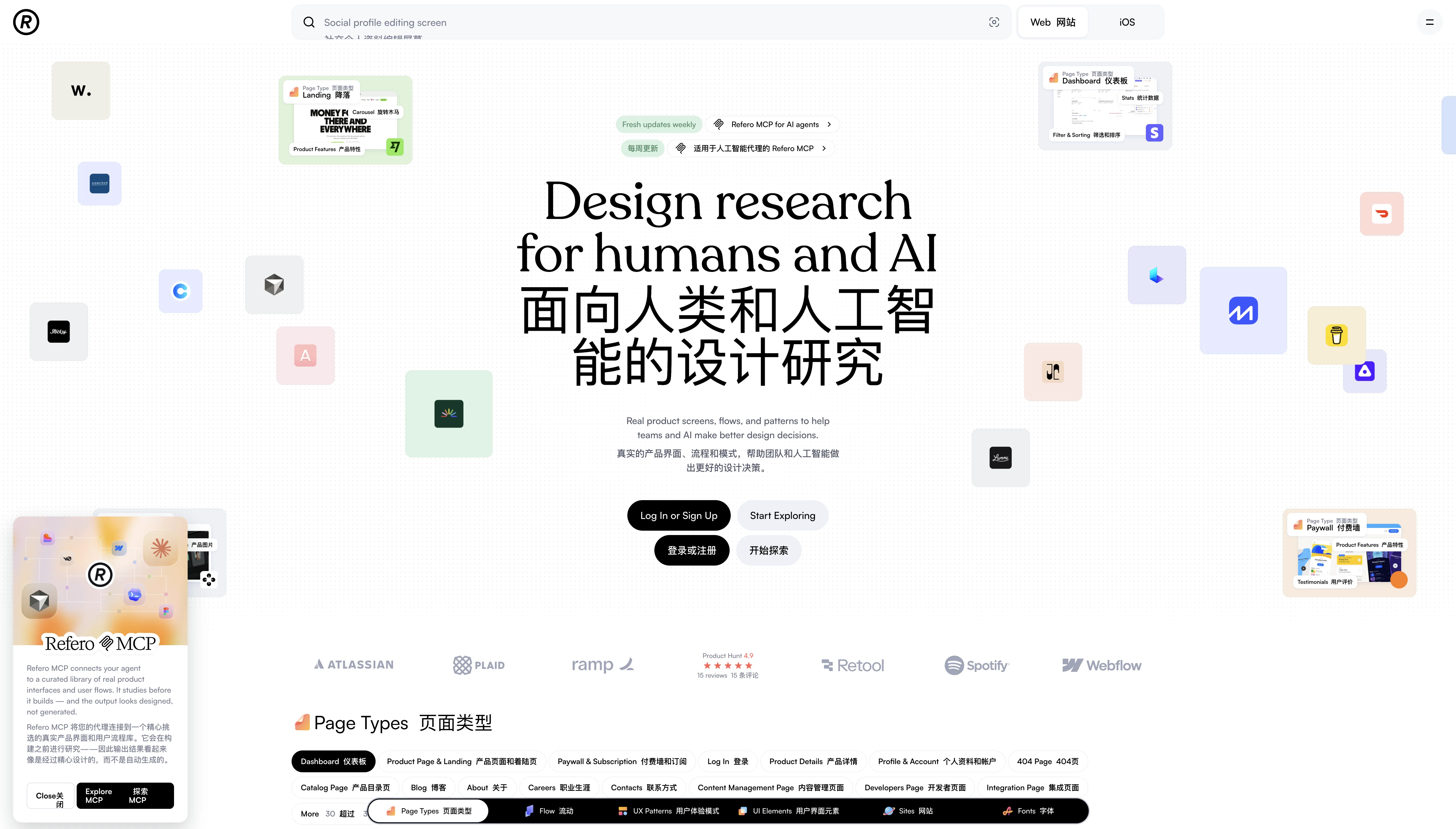
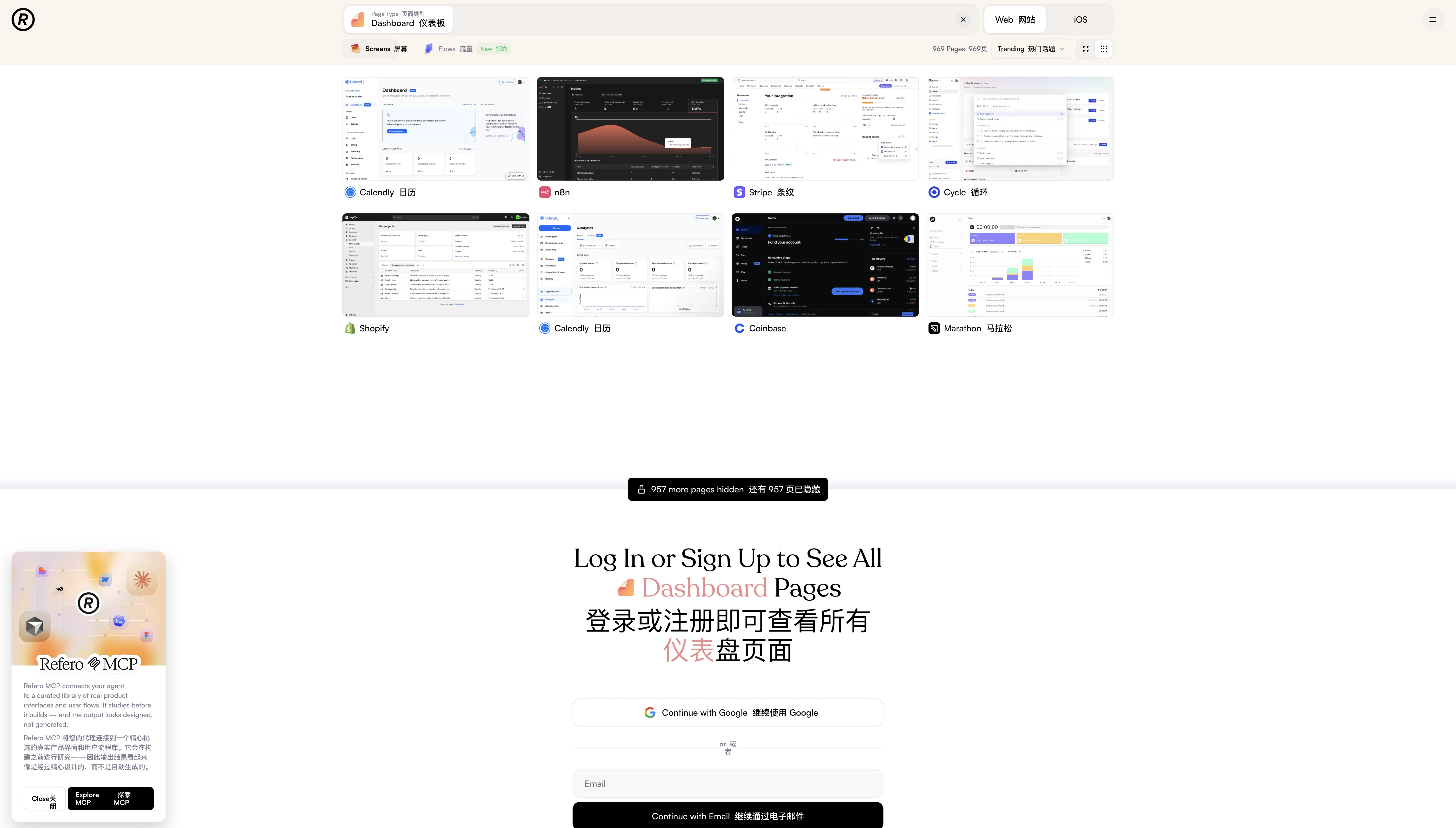
Refero is a recent discovery of mine, and it has the most granular categorization of any site on this list.
Six dimensions fully covered:
- Page Types (45): Dashboard, landing, paywall, 404, blog, profile, and more
- Flows (44): Sign up, login, subscribe, add to cart, chat, edit, delete account, and more
- UX Patterns (87): Testimonials, filter & sorting, dark mode, shopping, and more
- UI Elements (69): Modal, cards, table, tabs, skeleton, chart, and more
- Sites (by industry): AI tools, SaaS, finance, education, food, and more
- Fonts: Filter by typeface to find product pages using a specific font
The catalog features benchmark products like Stripe, Calendly, n8n, Shopify, and Coinbase.
What really stood out to me is its MCP integration — it lets AI agents directly access Refero's design library, so when building with AI, you can reference real product designs instead of generating generic "AI-looking" interfaces.
Best for: Web product design research, especially for SaaS products.
Free vs. paid: 7-day free trial, then paid subscription.
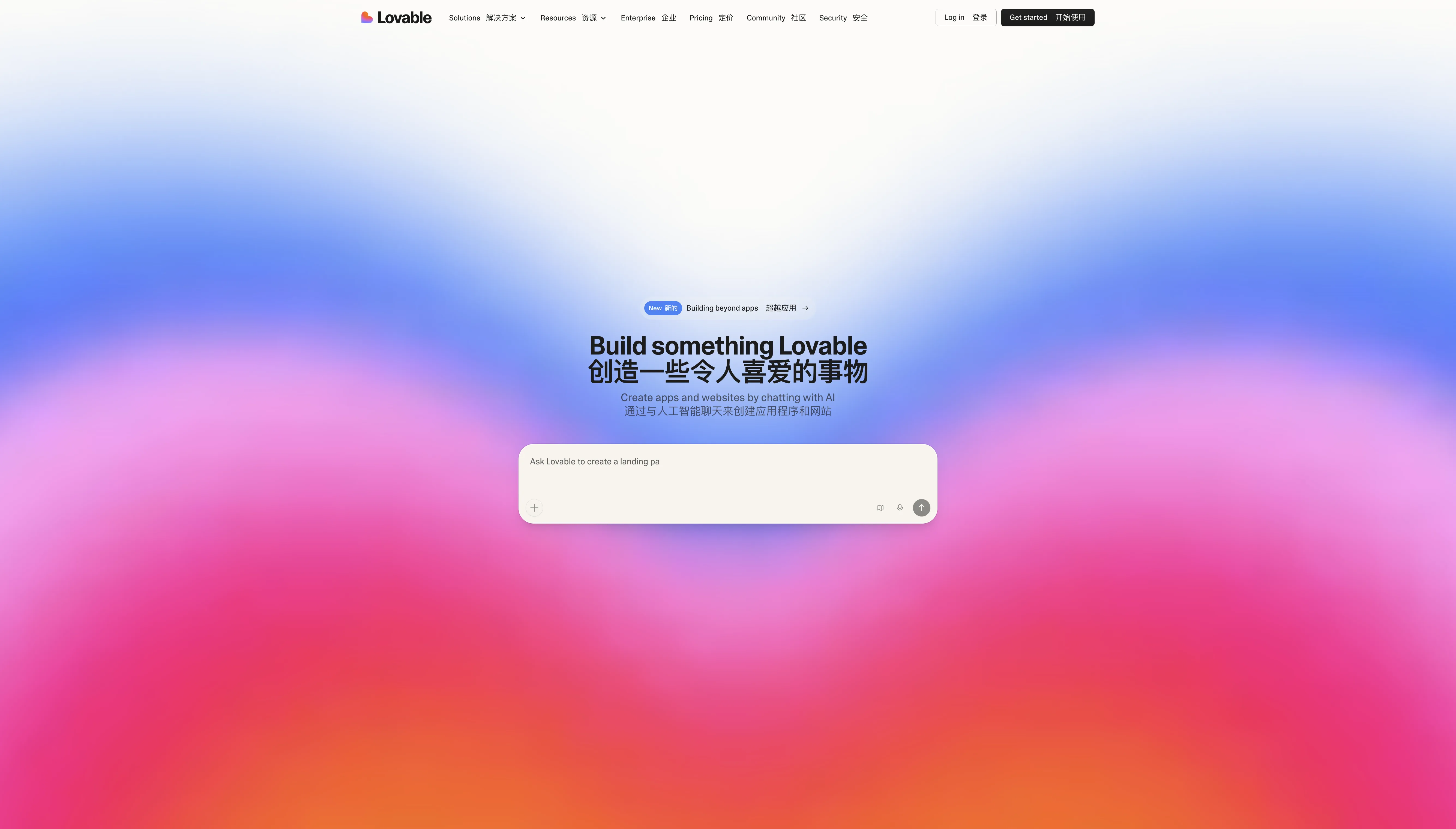
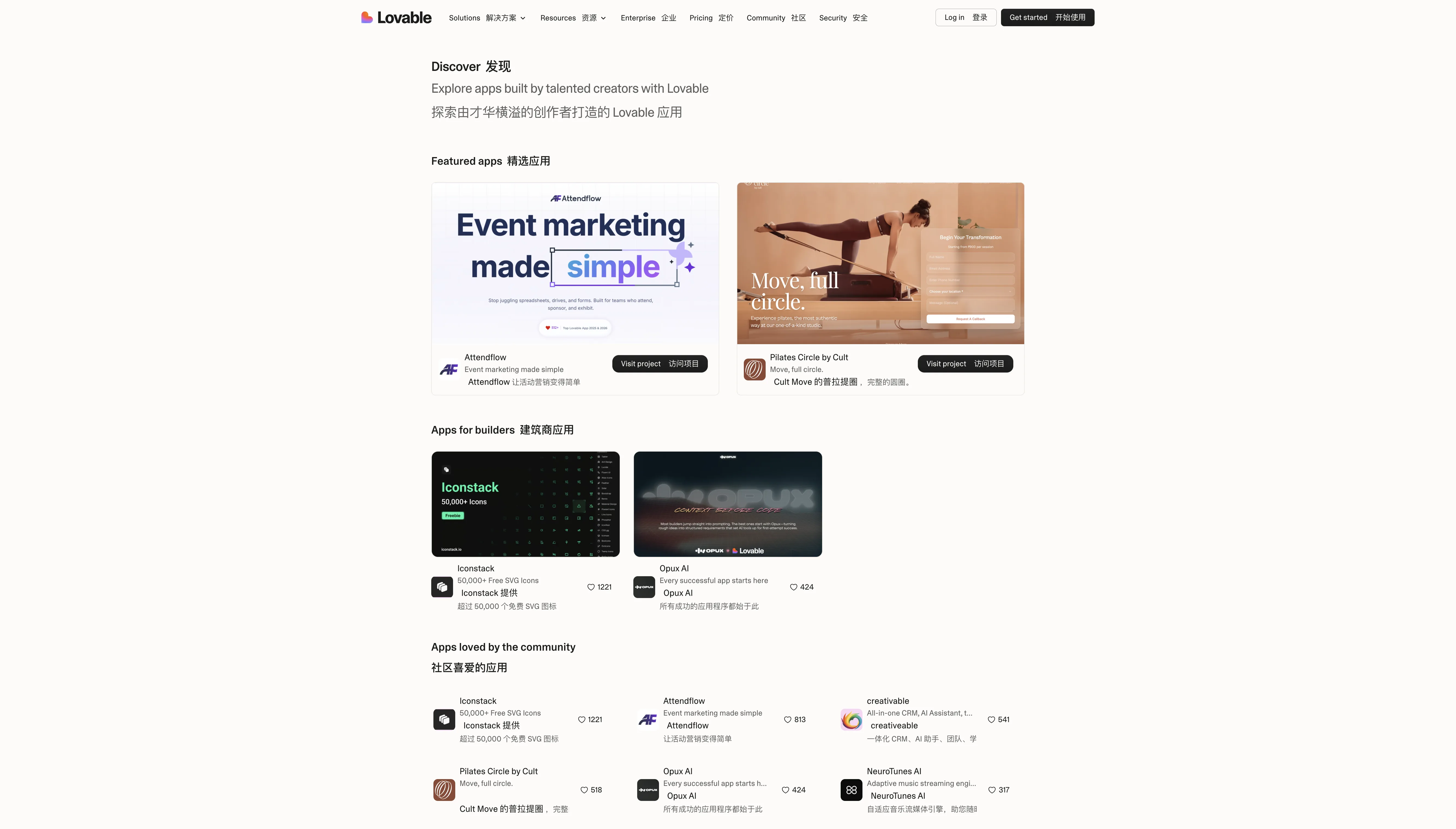
This last one is a bit different — Lovable itself is an AI website builder, but its Discover page doubles as a great source of design inspiration.
Every app showcased here was built through AI-driven conversation, giving you a firsthand look at what AI site builders can actually produce today. The range is broad — from CRMs and event marketing tools to music players and icon libraries.
Each app shows community engagement data (e.g., Iconstack with 1,221 favorites, Attendflow with 813 favorites), so you can gauge what resonates. Browse by Featured, Builders, Personal, Marketing, Company, and more.
Best for: Seeing what AI-built apps actually look like, or finding inspiration for rapid prototyping. Also useful for making the case to your team when pitching AI-powered development.
Free vs. paid: Browsing is free. Building with Lovable has a free tier; advanced features are paid.
Comparison Summary
| Site | Focus | Content Volume | Free / Paid | Best For |
|---|---|---|---|---|
| Mobbin | Mobile + web design patterns | Massive library of apps and screenshots | Freemium | Looking up design patterns for a specific feature |
| UI Notes | Chinese product UI screenshots | 396 apps / 150,000+ screenshots | Freemium | Competitor analysis in the Chinese market |
| Checklist Design | Design best-practice checklists | 56 checklists | Completely free | Design self-review and establishing standards |
| Page Flows | User flow recordings | iOS / Android / Web / Email | Paid (from $8.25/mo) | Designing user flows |
| Refero | Multi-dimensional web design research | 45+ page types / 87+ UX patterns | Freemium | SaaS product design research |
| Lovable Discover | AI-built app showcase | Community-submitted | Free to browse | Exploring what AI builders can do |
These 6 sites cover virtually all of my design reference needs in day-to-day product work. Bookmark them — next time you find yourself staring at a blank canvas, open one up first.